 Table of ContentsTable of Contents
  Previous Chapter
----------------------------------------------------------------------
Note:
The ValUI looks and behaves very much like the SimUI, the graph
ical user interface to the simulator monitor. The differences are the
set of available monitor commands and button modules, and a few
additional menus and sub windows.
For a description of the windows, menus and features in common to
both the SimUI and the ValUI, "Graphical User Interface" on page
1839. The following description of the ValUI will concentrate on
the additional features of the ValUI.
----------------------------------------------------------------------
No validator is started automatically by the ValUI in this way. The user must start a validator by selecting Open from the File menu, as stated in the text area of the main window, or by using the Open quick button.
A simple way to generate a validator, start the ValUI and open the validator is to click the Validate quick button in the Organizer.


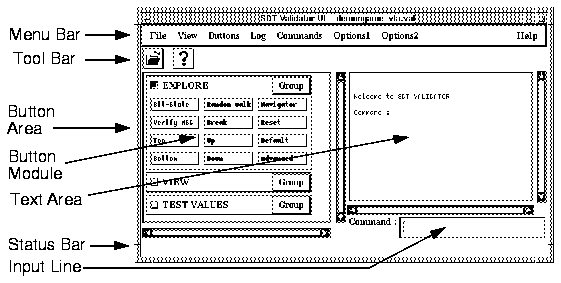
The main window of the graphical user interface consists of the following parts (see Figure 542):
Figure 542 : The Main Window.
-----
(fig)

-----
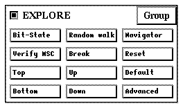
----------------------------------------------------------------------
Note:
The buttons in the button modules are specified in the button defini
tion file. If the default button file is not used, the button modules
may be different than described here. See "Button and Menu Defi
nitions" on page 1865 for more information.
----------------------------------------------------------------------
Figure 543 : The EXPLORE Module.
-----
(fig)

-----
---------------------------------------------------------------
Button       Monitor command
---------------------------------------------------------------
Bit-State    Bit-State-Exploration
Verify MSC   Verify-MSC
Top          Top
Bottom       Bottom
Random Walk  Random-Walk
Break        Pressing <Return>
Up           Up 1
Down         Down 1
Navigator    Show-Navigator
Reset        Reset
Default      Default-Options
Advanced     Define-Scheduling All ; Define-Priorities 1 1 1 1
             1 ; Define-Max-Input-Port-Length 2 ; Define-
             Report-Log MaxQueuelength Off
---------------------------------------------------------------
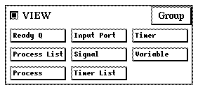
Figure 544 : The VIEW Module.
-----
(fig)

-----
-------------------------------------
Button        Monitor command
-------------------------------------
Ready Q       List-Ready-Queue
Process List  List-Process
Process       Examine-PId
Input Port    List-Input-Port
Signal        Examine-Signal-Instance
Timer List    List-Timer
Timer         Examine-Timer-Instance
Variable      Examine-Variable
-------------------------------------
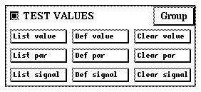
Figure 545 : The TEST VALUES Module.
-----
(fig)

-----
-----------------------------------------
Button        Monitor command
-----------------------------------------
List Value    List-Test-Values
List Par      List-Parameter-Test-Values
List Signal   List-Signal-Definitions
Def Value     Define-Test-Value
Def Par       Define-Parameter-Test-Value
Def Signal    Define-Signal
Clear Value   Clear-Test-Values
Clear Par     Clear-Parameter-Test-Values
Clear Signal  Clear-Signal-Definitions
-----------------------------------------
The menu bar contains the following menus:
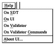
Figure 546 : The Help Menu.
-----
(fig)

-----
In addition to the generic Help menu choices On SDT, On <Tool> and About <Tool>, the ValUI's Help menu has two other menu choices:
The following tables list the default menu choices and the corresponding monitor command. See "Monitor Commands" on page 1889 for more information.
--------------------------------------------------------------------------
Note:
The additional menus in the ValUI are specified in the button defi
nition file. If the default button file is not used, the additional menus
may be different than described here. See "Button and Menu Defi
nitions" on page 1865 for more information.
--------------------------------------------------------------------------
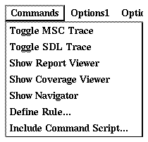
Figure 547 : The Commands Menu.
-----
(fig)

-----
------------------------------------------------
Menu choice             Monitor command
------------------------------------------------
Toggle MSC Trace        MSC-Trace
Toggle SDL Trace        SDL-Trace
Show Report Viewer      Show-Report-Viewer
Show Coverage Viewer    Show-Coverage-Viewer
Show Navigator          Show-Navigator
Define Rule             Clear-Rule ; Define-Rule
Include Command Script  Include-File
------------------------------------------------
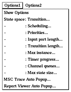
Figure 548 : The Options1 Menu.
-----
(fig)

-----
--------------------------------------------------------
Menu choice               Monitor command
--------------------------------------------------------
Show Options              Show-Options
State Space: Transition   Define-Transition
- : Scheduling            Define-Scheduling
- : Priorities            Define-Priorities
- : Input port length     Define-Max-Input-Port-Length
- : Transition length     Define-Max-Transition-Length
- : Max instance          Define-Max-Instance
- : Timer progress        Define-Timer-Progress
- : Channel queues        Define-Channel-Queue
- : Max state size        Define-Max-State-Size
MSC Trace Auto Popup      Define-MSC-Trace-Autopopup
Report Viewer Auto Popup  Define-Report-Viewer-AutoPopup
--------------------------------------------------------
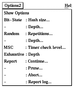
Figure 549 : The Options2 Menu.
-----
(fig)

-----
--------------------------------------------------------
Menu choice             Monitor command
--------------------------------------------------------
Show Options            Show-Options
Bit-State: Hash size    Define-Bit-State-Hash-Table-Size
- : Depth               Define-Bit-State-Depth
Random: Repetitions     Define-Random-Walk-Repetitions
- : Depth               Define-Random-Walk-Depth
MSC: Timer check level  Define-Timer-Check-Level
Exhaustive: Depth       Define-Exhaustive-Depth
Report: Continue        Define-Report-Continue
- : Prune               Define-Report-Prune
- : Abort               Define-Report-Abort
- : Report Log          Define-Report-Log
--------------------------------------------------------
The Watch window of the ValUI is identical to the SimUI (see "The Watch Window" on page 1861). The only difference is the syntax of the variable definitions. In the ValUI, variables are defined by the syntax <process instance> <variable name>, e.g. Game:1 Count.
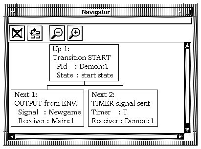
Figure 550 : The Navigator Window.
-----
(fig)

-----
Double-clicking a node in the Navigator executes the corresponding tree transition and moves one level up or down in the behavior tree. The current system state is changed and the Navigator window is updated to show the situation around the new system state.
-----------------------------------------------------------------
Note:
Double-clicking a collapsed node (see below) does not expand the
node; it always executes the corresponding transition.
-----------------------------------------------------------------
The Navigator window is also updated whenever a monitor command is executed that changes the current system state.
-------------------------------------------------------------
Up 1                 On the up node: Go up one level in
                     the tree. This is the same as double-
                     clicking the up node.
Up to top            On the up node: Go to the top of the
                     behavior tree.
Goto                 On the down nodes: Go down this
                     branch of the tree. This is the same as
                     double-clicking the down node.
Expand               Expand the collapsed node to show
                     the down nodes.


                     (Not applicable on a down node.)
Expand Substructure  The same as Expand.
Collapse             Collapse the node to hide the down
                     nodes. A small triangle below the
                     node shows that it is collapsed.


                     (Not applicable on a down node.)
-------------------------------------------------------------
-------------------------------------------------------------------------------
(fig)  Close
       Closes the Navigator tool.
(fig)  Structure
       Switches between a tree structure and a list structure in the node area.
-------------------------------------------------------------------------------
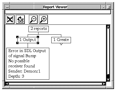
Figure 551 : The Report Viewer.
-----
(fig)

-----
--------------------------------------------------------------
Goto                 Only on report nodes: Go to the
                     report. This is the same as double-
                     clicking the report node.
Expand               Expand the collapsed node to show
                     the nodes in the next level of the tree.
                     This is the same as double-clicking
                     the collapsed node (top node or report
                     type node).


                     (Not applicable on a report node.)
Expand Substructure  Expand the collapsed node to show all
                     nodes on all levels below it.


                     (Not applicable on a report node.)
Collapse             Collapse the node to hide all nodes on
                     all levels below it. This is the same as
                     double-clicking the node (top node or
                     report type node).


                     (Not applicable on a report node.)
--------------------------------------------------------------
---------------------------------------------------------------------------------
(fig)  Close
       Closes the Report Viewer.
(fig)  Structure
       Switches between a tree structure and a list structure in the report area.
---------------------------------------------------------------------------------
Table of Contents  Next Chapter